NYC Public Schools logo

Building one unified platform for 1.1M+ students across 1,800 NYC public schools

B2B

Complex Workflows

Data Privacy

Multi-Role Access

Project

OASIS — Confidential Services Module

Client

NYC Department of Education

Role

Solo UX Designer

Timeline

March 2024 – August 2025

Scope

8 sub-modules · 3 user roles · Full design-to-QA lifecycle
Confidential Services Dashboard overview

Overview

One designer owning the full design lifecycle
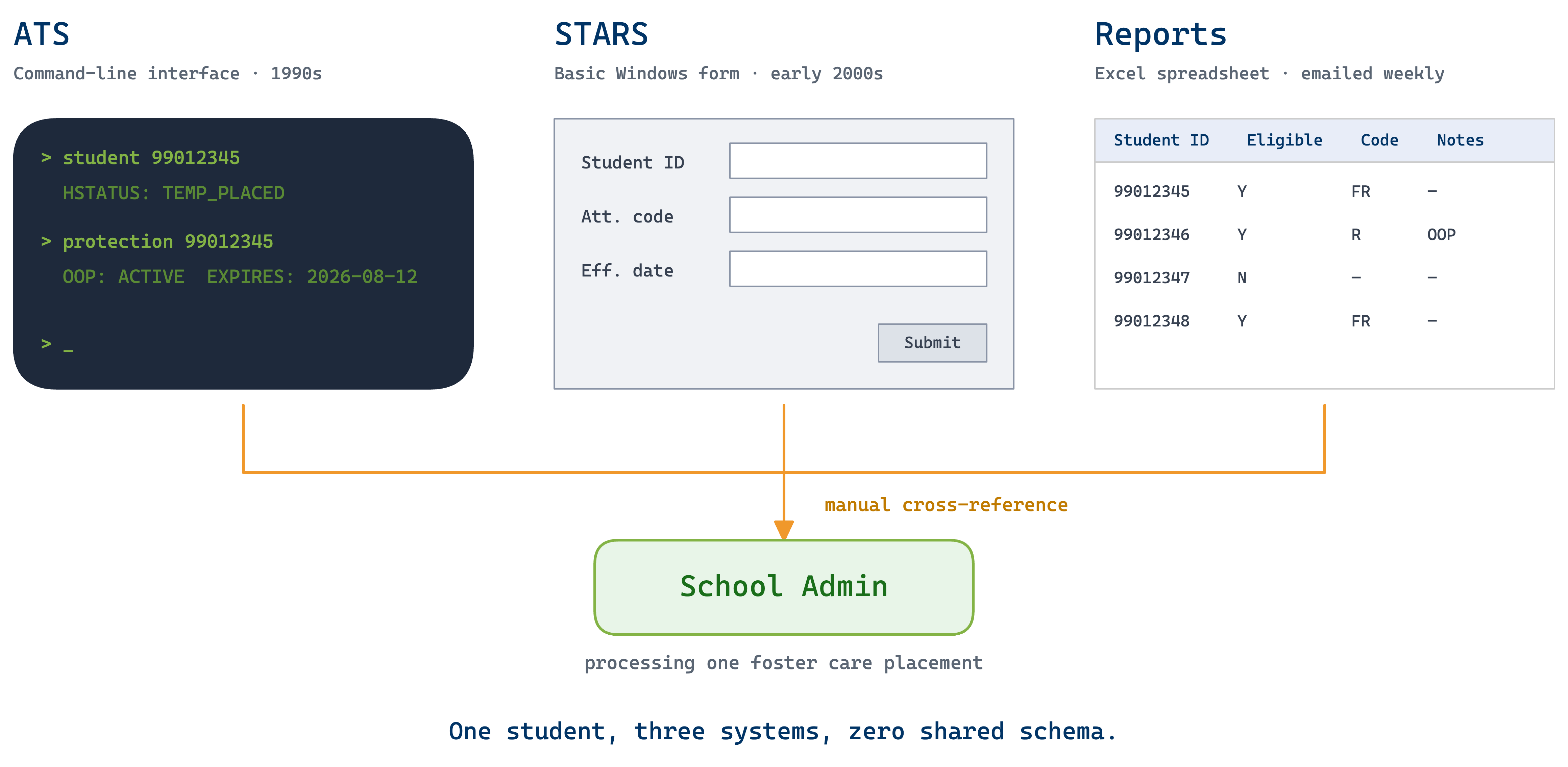
🛠️ How I Worked

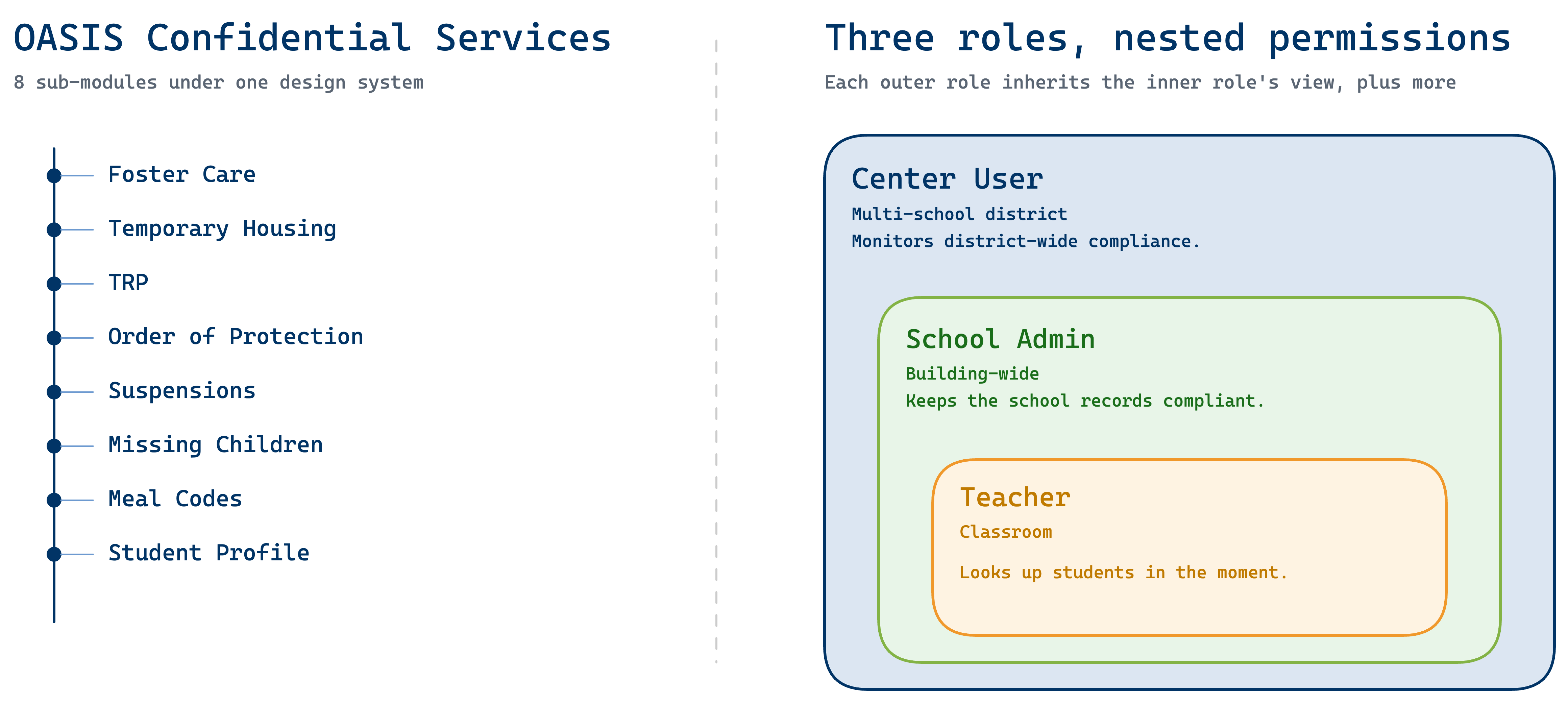
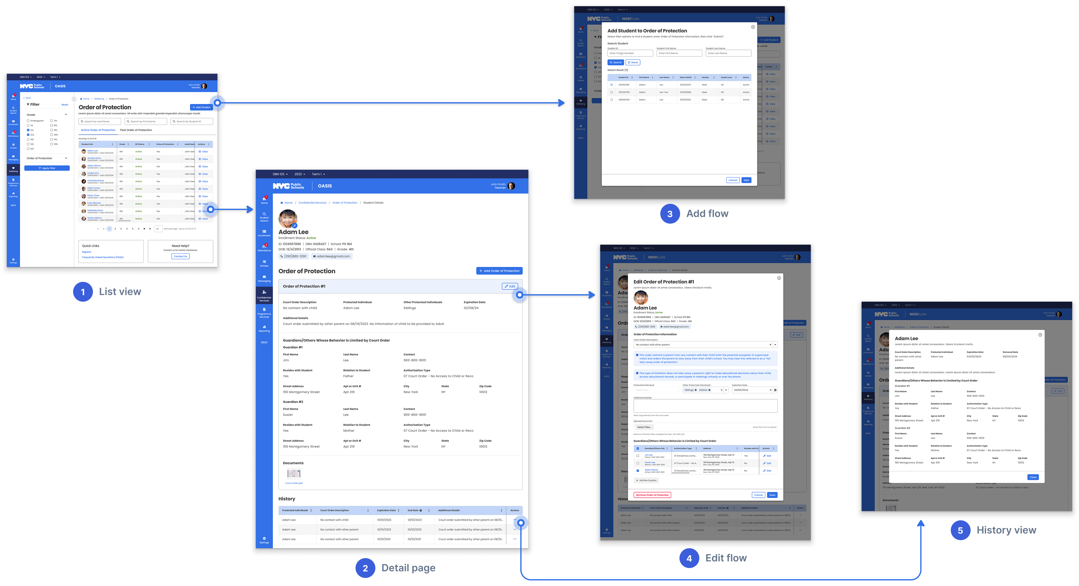
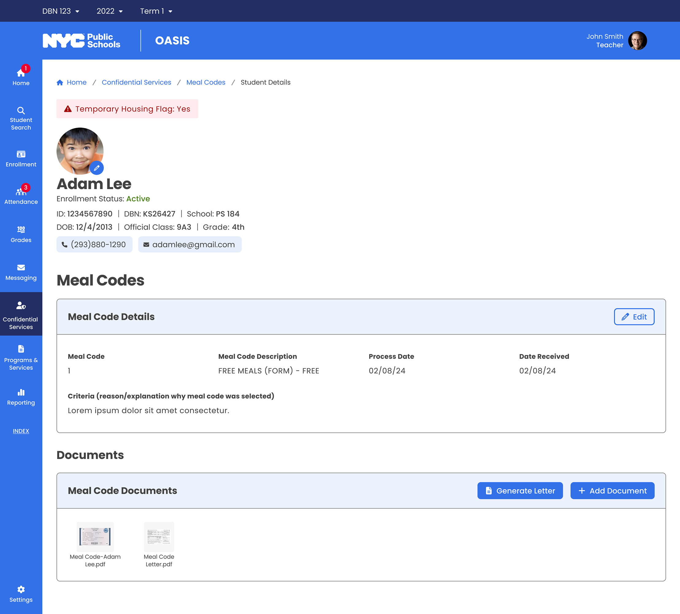
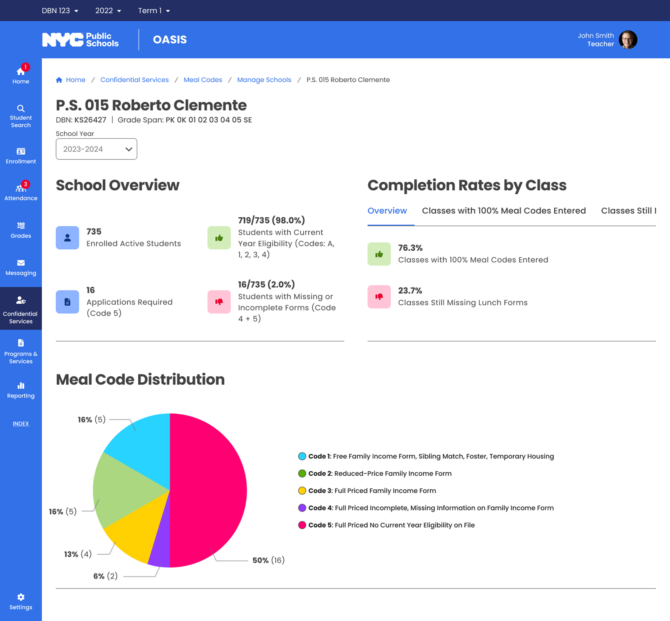
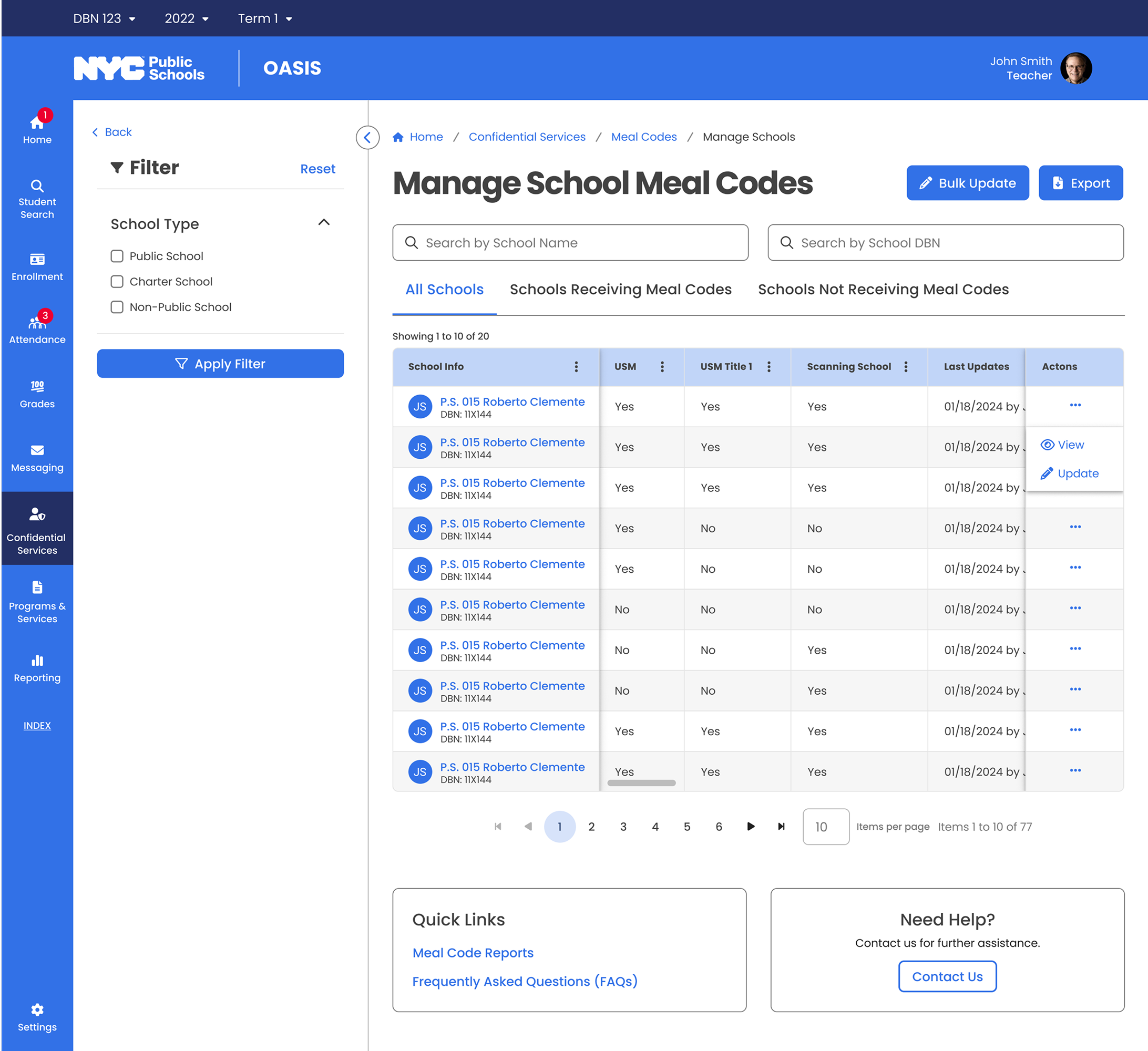
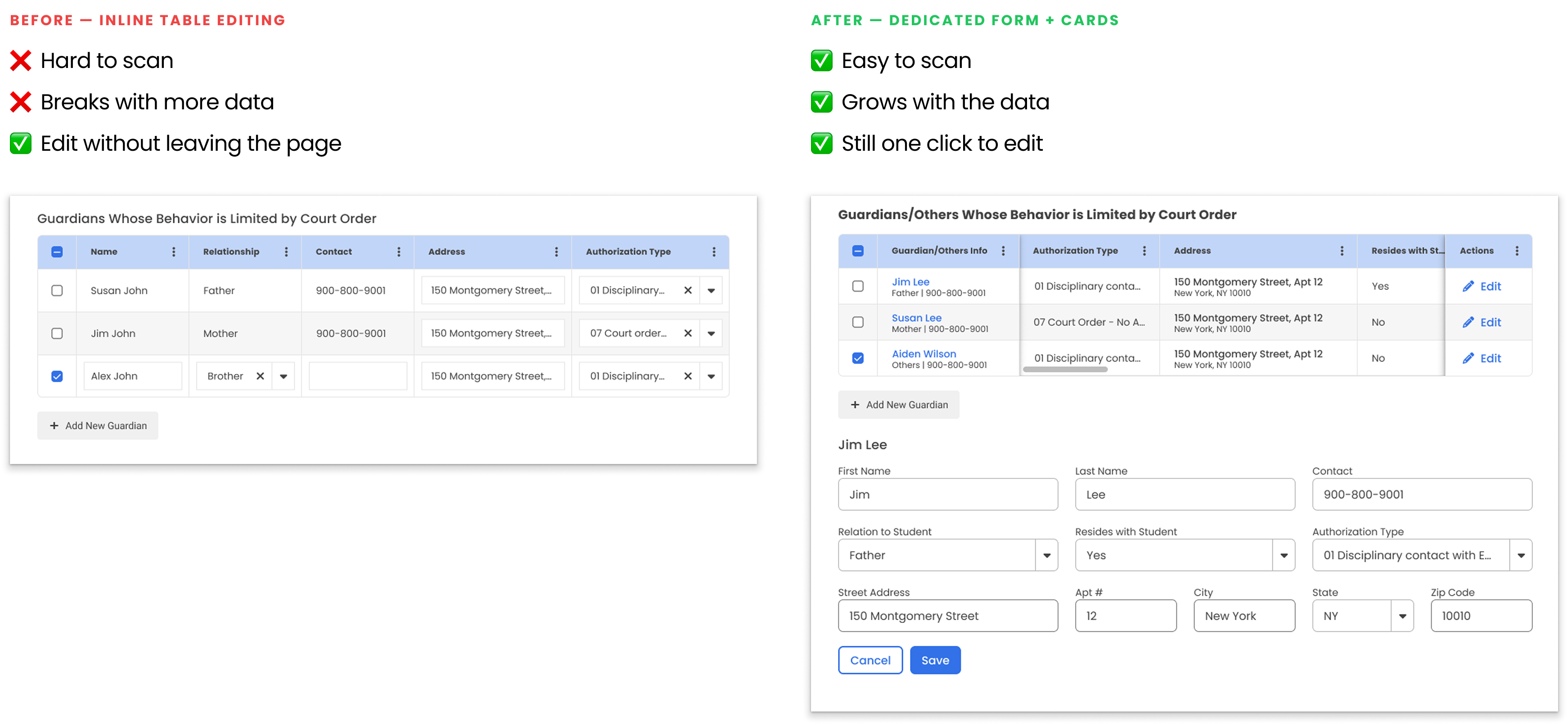
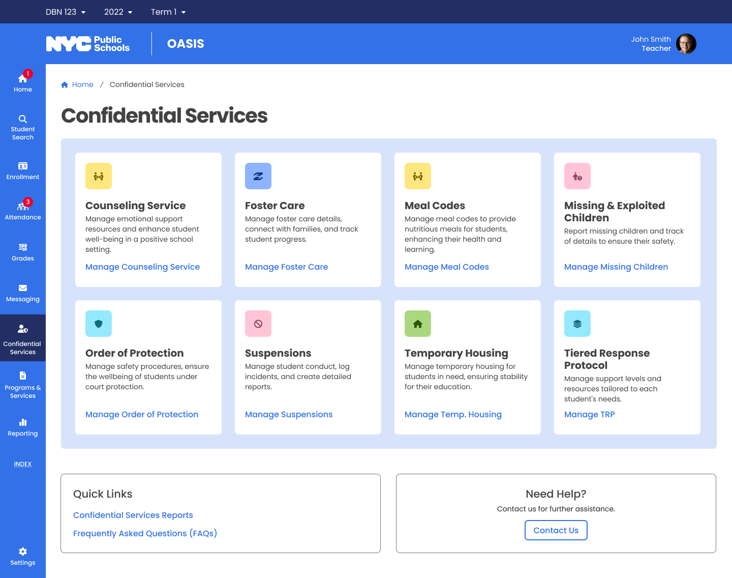
Sole designer across the full lifecycle — business requirements, wireframes, hi-fi specs, and QA documentation. Led cross-functional reviews with engineers, BAs, and compliance teams across 8 sub-modules over 1.5 years.

🚀 What Shipped

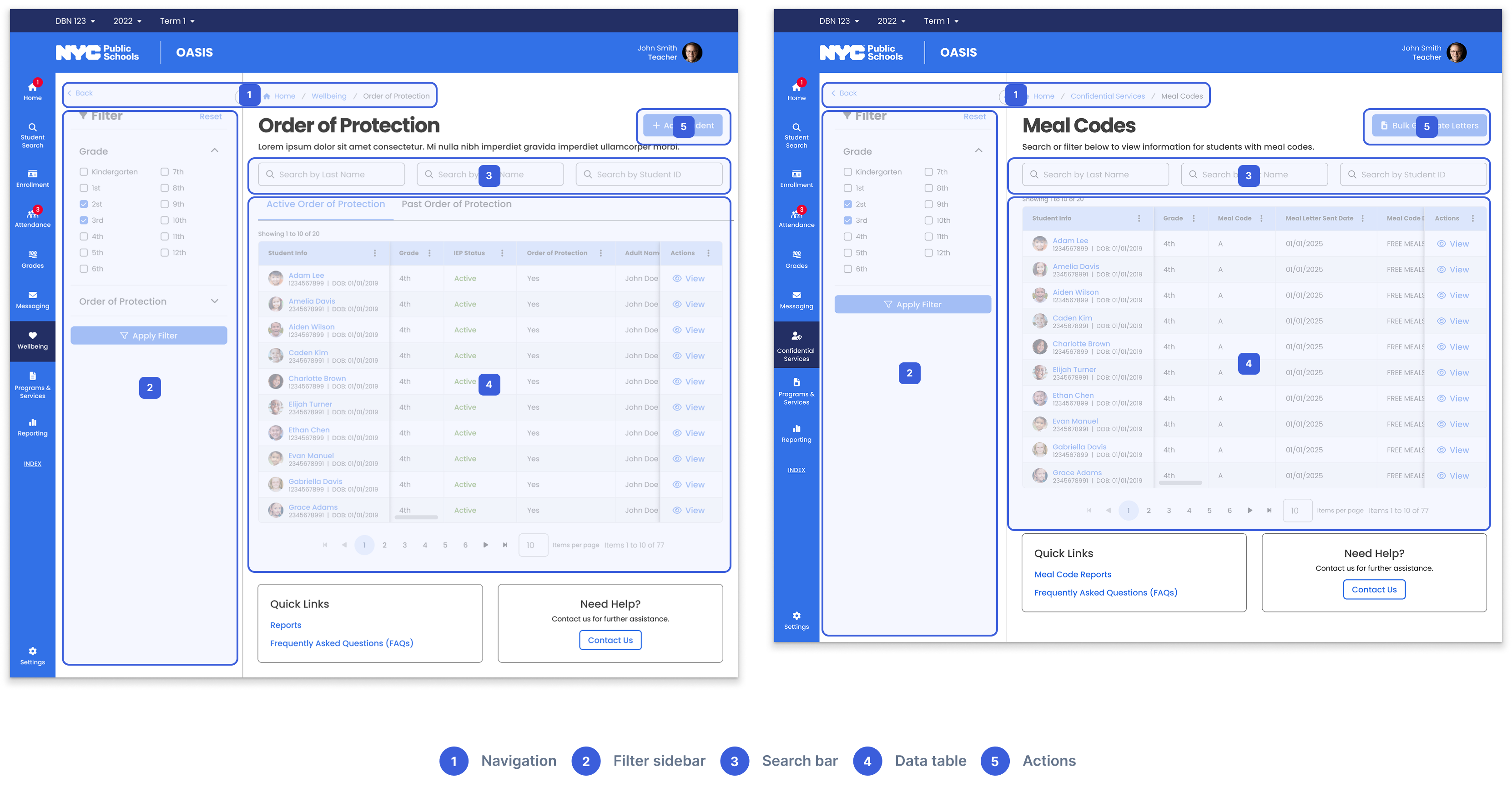
A unified interaction system deployed to 1,800 schools — one consistent pattern that scaled from 8 sub-modules to 12+ without redesign.

Context

The system behind NYC's most sensitive student records.

OASIS is the student information system for New York City's K-12 public schools — the largest school district in the United States. The Confidential Services module handles foster care placements, temporary housing, orders of protection, missing children reports, and meal eligibility.

Three user roles depend on this data daily, each with different responsibilities and data scope:

Teacher

Scope: Classroom

Quick access to individual student records — meal eligibility, active orders of protection — so they can respond in the moment.

School Admin

Scope: Building-wide

Processing foster care placements, updating housing records, ensuring the school's data is complete and compliant.

Center User

Scope: Multi-school

Monitoring compliance across an entire district, identifying schools behind on updates, drilling into any school's data when issues arise.

Three roles with different content, permissions, and workflows — what each person sees depends on their responsibilities.

Project structure

Problem

Sensitive records trapped in systems built decades ago.

The legacy systems

Before OASIS, staff relied on STARS — a command-line interface with text-based navigation — and a basic Windows application with simple forms. Neither was designed for modern compliance requirements.

The daily reality

A school admin processing a foster care placement might check one system for housing status, another for orders of protection, and a spreadsheet for meal eligibility — all while ensuring privacy compliance across disconnected tools.

Student Tracking System (STARS)
Attendance Tracking System (ATS)
Meal Code Report

Three systems, manual cross-referencing

Challenges

Eight modules, three roles, zero margin for error.

🧩 8-in-1 Product

Eight categories from foster care to meal codes — each with its own data model, compliance rules, and edge cases. All needed to feel like one product.

🎭 Role-Based Complexity

Three roles touch the same data but need entirely different views, permissions, and workflows. One-size-fits-all would fail usability and privacy.

🤝 Stakeholder Alignment

Each sub-module had its own compliance team, SMEs, and DOE program office — aligning them required constant communication and iterative reviews.

Solution 01

Learn it once, navigate anything.

Challenge

Eight sub-modules with different data types could easily become eight separate products. Staff deal with high-stakes, time-sensitive situations — relearning the interface for each record type adds cognitive load where it matters most.

Solution

I designed a consistent pattern — list view → detail page → add/edit → history — across all 8 sub-modules. Staff who learn one category can navigate any other without retraining. This pattern later scaled to 4+ additional modules.

OOP List View — consistent pattern across sub-modules

List → detail → add/edit → history

Meal Codes List View — same structure, different data

Different modules, same pattern

Solution 02

Every role sees exactly what they need.

Challenge

Meal code compliance lived in standalone PDFs, per-school spreadsheets, and manual cross-referencing. Center users had no aggregated view — they checked compliance school by school, manually cross-referencing PDF reports.

Solution

I redesigned the information architecture into role-appropriate views:

Teacher view: meal eligibility records at classroom level

Teachers · Classroom

Meal eligibility records — just what they need to respond in the moment.

School admin view: building-wide meal code management

School Admins · Building-wide

Complete meal code data — update records, resolve discrepancies, run reports.

Center user view: multi-school compliance dashboard

Center Users · Multi-school

Aggregate compliance dashboard — drill down to any school when needed.

Solution 03

Designing for data that keeps growing.

Challenge

The original guardian information design worked for simple cases — one or two guardians. As requirements grew, more guardian types and fields needed accommodating. The initial layout couldn't absorb the growth.

Solution

I redesigned guardian info as structured cards: name and actions at top, scrollable detail area, clear separation between entries. Whether one guardian or six, the layout stays organized and scannable.

Before and after: inline table editing to structured guardian cards

Structured cards that scale with data

Impact

Real improvements for the people doing the work.

~70%
Fewer Screens

What previously required navigating 5-6 separate screens now lives in one unified interface.

8 → 12+
Modules Using One Pattern

The interaction model designed for 8 sub-modules scaled to 4+ additional modules without redesign.

~60%
Faster Onboarding

Staff trained on one category could navigate all others immediately — because every sub-module follows the same pattern.

1,800
Schools Served

Live and serving staff who manage safety records for 1.1 million students across NYC's public school system.

Recommendations

What my colleagues say

"Huchong is a talented and thoughtful UX designer with a strong sense of clarity and consistency. He simplifies complex problems with ease and delivers user-centric solutions with professionalism and calm focus. Any team would benefit from his design maturity and collaborative spirit."

Phani Vasireddy
Phani Vasireddy
UI/UX Designer

"Huchong is a talented and highly reliable UI/UX designer. I oversaw his work on an expansive project with the NYC Department of Education, and he consistently delivered quality work in a timely manner in a high-pressure environment. I would gladly work with him again on future projects."

Jennifer Tavis
Jennifer Tavis
OASIS Project Director

"Huchong is a talented UX Designer who's always approachable and willing to help. He consistently delivered quality work on time and made collaboration effortless — truly one of the best to work with. His reliability, creativity, and supportive nature make him an asset to any team."

Minu George
Minu George
Business Analyst

Takeaways

What I learned

🧱 Consistency Reduces Risk

Cognitive load isn't just a UX problem — it's a safety problem. Shared patterns mean staff focus on the student, not the interface.

💬 Communication Drives Clarity

Different compliance teams for each sub-module meant defining the right problem depended on asking the right questions. Review decks became the alignment tool.

🔒 Privacy Is a Design Material

Federal and city regulations shaped every default state and permission level. Privacy wasn't a constraint — it was a core design material from the start.

Thanks for reading! 🙇🏻